
Showing posts with label Writing. Show all posts
Showing posts with label Writing. Show all posts
Thursday, 8 August 2013
Fringe Reviews for Broadway Baby
During this years Edinburgh Fringe I am reviewing shows for Broadway Baby. I am reviewing theatre, physical theatre and spoken word shows. My reviews can be read here.

Sunday, 14 April 2013
Writing on Film - Article 6 - Undressing Almodovar.
Undressing Almodóvar
Spanish Director Pedro Almodóvar
has been making movies for over 30 years. Picking up 2 Oscars, 5 BAFTAS and
scores of nominations, Almodóvar is one of Europe's finest directors. His
movies amuse and provoke, with controversial themes and a distinct colourful
style.
Many ingredients go into making a successful Almodóvar movie. Shocking and venomous dialogue reveals
character, close ups express intimate moments of passion and music heightens
emotion and drama. But what part do clothes and fashion play? This is a
question that Almodóvar has asked throughout his career, addressing in many
significant and diverse methods.
Take his debut feature Pepi, Luci, Bom (1980) for example.
Here we see style on a budget, but glamour no less. Sophistication and clothing
separate the three characters who lend their names to the title and express
their disparate personalities and social diversity.
Bom wears Vivienne Westwood inspired DIY punk fashions, Luci a
middle class house wife wears expensive lace dresses, while Pepi falls
somewhere in between, preferring high street fashions. These characters find
their lives intertwined through circumstance and tragedy and Almodóvar has
employed fashion as a uniform, to present their separate lives, distinct styles
and social background.
Dark Habits (1983) continues Almodóvar's distinct use of fashion. Yolanda
(Cristina Sanchez Pascual) is a provocative night club singer, who joins a
covenant after her boyfriend dies of a heroin overdose. Even though she is in a
nunnery, Yolanda does not conform to their uniform and instead continues to
wear a bright red glittering ball gown. Previously Almodóvar utilised fashion
to express social status, but here psychology is apparent. Yolanda is her own
woman, non-conformist in attitude and style. Dark Habits is also of
great interest when looking at Almodóvar's use of fashion. A priest in the
covenant is obsessed with English costume designer and photographer Cecil
Beaton. Famous for his Oscar winning designs for My Fair Lady and his fashions
shoots for British Vogue, Beaton is an interesting obsession for a Priest and
Almodóvar knows this. The covenant has its rules and regulations and each of
the Nuns rebel in their own way (one is a cocaine addict, another a writer of erotic
fiction), but the Priest rebels through fashion. His obsession with Beaton is
his method off breaking free from the uniform and illustrates that clothing can
be expressive and powerful in revealing the true character behind occupation
and beliefs.
Almodóvar's fashion obsession was apparent in his break through
movie, the chilling thriller Matador (1986). Starring a young Antonio Banderas
as Angel, a trainee Matador who obsesses over his Maestro's girlfriend Eva.
Here a fashion show displays absurdity and is utilised for comedic effect. The
victimised Eva is a model and Almodóvar exposes the exuberant and indulgent
world of fashion. When a nameless model vomits over a colleague (after
explicitly shooting up heroin), the flamboyant designer at the helm (played by
Almodóvar himself), proclaims "Don't worry, it looks great on you".
Maybe not fashion expressed as a uniform, but definitely as a means to offer
relief from a movie that expresses sex and desire through a lack of romance or
passion.
After the success of Matador, Almodóvar had the budget to employ
the services of big name designers such as Jean Paul Gaultier, Karl Lagerfeld
and Giovanni Versace.
These collaborations are particularly intriguing when looking at
how Almodóvar employs style to express psychology and story. Lagerfeld and
Gaultier are auteurs in their own right, however in the world of fashion. On
one hand you have a director whose objective is to tell a story and convey
various provocative themes and on the other you have a fashion designer whose
objectives may not be to tell a story, but to make the actor look good with
garments designed by The House Of Chanel or The House Of Gaultier.
With Kika (1993) Jean Paul Gaultier worked with Pedro
Almodóvar on his first of three collaborations, partnering again with Bad
Education (2004) and The Skin I Live In (2011). For Kika,
Gaultier designed the costumes for the intimidating and boisterous Andrea
"Scarface" (Victoria Abril). Kika's themes include sex,
death and most prominently voyeurism. Gaultier clearly embraced the latter and
created a costume that not only explicitly conveys voyeurism, but removes the
character from the reality of the movie and heightens her to an other worldly
being, who spies on individuals and attempts to undercover the truth.
Andrea wears a dark green uniform with military undertones and a
large cumbersome, evocative camera on top of a helmet that tightly encases her
head. Within the context of the film she brazenly stands out, with the male
lead of the movie, Nicolas (Peter Coyote) proclaiming "I thought you were
a Martian". However this is the only reference to her obvious and unique
visual singularity. Almodóvar has ensured she is treated like a human through
the respect other characters show her, via dialogue and attitude, and the lack
of reaction they have to her appearance. Gaultier has countered this by making
her visually stunning.
But does this method progress the story or go against the grain of
the dark comedy of Kika? In balance the technique works. The audience is
in no doubt of the intrusive nature of Andrea. Just her being explicitly
conveys voyeurism and intrusion and effortlessly advances the character through
the movie, where she reveals the twist in the plot that exposes Nicolas' dark
secret.
Significantly the other costumes in Kika were supplied by
Giovanni Versace, another renowned fashion designer. Versace took a subtle
approach with less prominent designs, however Kika has one key scene
that is a major topic for debate. A rape occurs between the character of Kika
(Veronica Faroque) and an escaped convict and sex craved porn star Pablo
(Santiago Lajusticia). It is important to note both characters are wearing red,
a colour associated with danger, anger and lust. The rape scene itself is controversial. Lasting several minutes,
where Kika's protests and outrage turn to resolution as she accepts the sexual
assault. Here Versace's stylings clearly reflect the complex predicament and
the bright red clothing foreshadow the horrific ordeal Kika is put through.
Gaultier himself does embrace subtlety in his approach to The
Skin I Live In. Here plastic surgeon Robert Legard (Antonio Banderas)
performs sex reassignment surgery on a young man named Vincente, transforming
him into Lagard's attractive but deceased wife Vera Cruz (Eleanor Anaya).
The Skin I Live In is a change of pace and style for Almodóvar. A
psychological horror film at heart, the movie feels more placid visually, with
the bright colours of Kika and Pepi, Luci, Bom replaced with
delicate tones. Gaultier's approach is masterful, dressing Anaya in tight body
suits that explicitly present her feminine body (even though a hidden
masculinity lies underneath) and actually refer back to the movie's title. The
body suits have skin like tones alluding to nakedness and expressing the skin
that she now lives in is actually separate from herself. This presents a
complex psychology via a bold yet subtle uniform.
High Heels (1991) employs another well known fashion designer to dress
Victoria Abril, here playing the vulnerable character of Rebeca Giner. Karl
Lagerfeld (Head Designer and Creative Director for Chanel), takes a more
distinct approach, dressing Abril in glamorous and distinguishable Chanel
suits, accessorised by the iconic Chanel hand bag.
The story revolves around the news reader Rebeca, whose alluring
mother Becky del Paramo (Marisa Paredes) is a popular singer in South America.
She returns to Madrid to find Rebeca married to her former lover Manuel (Feodor
Atkine). Manuel is murdered and Rebeca dramatically confesses to the act while
reading his obituary live on air.
Here costume not only progress the story, but reveals character
traits and society, particularly when we are first exposed to Rebeca. As she
sits in the airport waiting for her mother, we clearly see the Chanel label on
Rebeca's hand bag. Moments later Becky del Paramo (dressed not in Chanel but in
Giorgio Armani) compliments her daughter's "Chanel Suit". Despite
just being introduced to the characters, clothing has presented them as
affluent individuals, expressing wealth through fashion labels and showcasing
prosperity like an expressive uniform for all to see.
Cynics could say the blatant Chanel references are advertisements
or product placement, however as Chanel is synonymous with fashion, it is
unlikely a Fashion House of such grandeur requires the films of Almodóvar for
promotion. Therefore in conclusion the clothing choices of Rebeca allow us to
make assumptions about how she perceives herself. Also the fact that the mother
wears Armani and the daughter Chanel, presents a conflict through opposing
styles. This conflict continues as mother and daughter fight over the
affections of Manuel and debate who is really responsible for his murder.
Throughout his career Almodóvar has employed fashion in various
degrees, with themes and character expressed through style. With Almodóvar's
new movie I'm So Excited due to hit the screens and being based around
an airline flight crew, it will be interesting to see what themes will be
conveyed and how he takes fashion, and a literal uniform in this instance, to
new heights.
Steven Fraser
Thursday, 28 February 2013
Poetry and Paint Exhibition - Dunny Toys and Poetry
I have several pieces of artwork
and poetry displaying at an event in London on 30th of March 2013. The event is
called Poetry and Paint and is being organised by Carmina Masoliver . I
am exhibiting 2 custom made Dunny toys along with two commissioned poems to go
with the work. There is also an anthology book which will be released at the Poetry and Paint
event, in which I will have images of the Dunny's along with the poems, plus
another image and poem. The image is of a large pastel drawing I completed a
few months ago and a poem in relation to the imagery.
Below have included a poster for the event and also the name tags for the Dunny's. I will post up images of the Dunny's after the event.


Below have included a poster for the event and also the name tags for the Dunny's. I will post up images of the Dunny's after the event.


Wednesday, 27 February 2013
Writing on Film - Article 5 - Ralph Bakshi
Ralph
Bakshi is an animation director of films such as Cool World, American Pop,
Coonskin, Fritz The Cat, Wizards, Heavy Traffic and a now overshadowed version
of Lord Of The Rings. From my Writing on Film class I had to choose to do a
profile on a film personality. I chose Ralph Bakshi as I knew nothing about
him. It gave me an opportunity to watch some of his films and analyse them.
This article will be reworked for when I hand it in with my portfolio for
review. The article is below:
RALPH
BAKSHI
Ralph Bakshi creates animated movies like no one else working in
the medium. He tackles a variety of styles and genre's ranging from fantasy
(Wizards, Lord of The Rings), Blaxplotation (Coonskin), adult comedy (Fritz The
Cat) and musicals (American Pop). Bakshi makes films he wants to make and even
though flaws are obvious, his passion, diversity and artistic vision is
apparent throughout, making him an appealing director and an interesting artist
to explore.
Born in 1938 in Haifa (then a Palestinian territory, now part of
Israel), the Bakshi family migrated to New York in 1939 to avoid World War 2.
American culture is very much part of Bakshi's films. Growing up in the
Brownsville area of Brooklyn he was clearly exposed to a range of cultures and this is reflected in
his films.
Bakshi's first feature length animation was an adaption of a comic
book by counter culture icon Robert Crumb. Released in 1972, Fritz The Cat
tells the story of a smart talking anthropomorphic feline who takes drugs, has
sex and considers himself a poet. Being the first X Rated American animated
film Bakshi does not hold back when presenting drug abuse in a cartoon New
York. The loose hand drawn style does little to distract from a uninteresting
story that relies on blatant sexual imagery to engage the viewer, however the
lack of restraint feels manipulative and prevents any real connection to the
main character. The result is a cold film where Bakshi's vision was to remove
animation from the niceties of Walt Disney and push it to X rated
extremes. Speaking at the 2008 San
Diego Comic Con Bakshi highlighted his lack of respect for Disney and his
desire to do things his own way. Although admiral, the reactionary nature
stifles Bakshi's work and is apparent in his 1975 film Coonskin.
Coonskin homogeneously combines live action and animation and has
been described by Quentin Tarantino as "The most incendiary work in the
entire genre" in reference to Blaxplotation. Starring Barry White (whose
deep baritone voice is perfectly cast as Bear) again we see sex and drug abuse
and follow two gangsters who make it to the top of the Harlem criminal
underworld. Despite plaudits from Tarantino, Coonskin has similar problems to
Fritz The Cat, with the need to shock being second to the uninspiring story.
However the influence to Tarantino is obvious and clearly inspired Pulp
Fiction, making Coonskin an interesting movie within this context.
Wizards (1977) is a family fantasy film and a precursor to his now
overshadowed adaption of The Lord Of The Rings. We are in a post apocalyptic
planet earth where a war rages between good and evil. Here Bakshi presents
diversity in the chosen genre which is far removed from Coonskin. Visually
Wizards is bland with the vast landscapes appearing insipid, with pale purple
colours and a distinct lack of detail. Although this in part could be due to
time and money constraints. Without major financial backing Bakshi had to
economise when making his movies, cutting corners wherever possible, but for
Wizards this is obvious and to the determent of the imagery. Undertaking a method known as posterisation
(a photographic development process where areas of colour are graded to
separate tones and present a colourised image) Bakshi entirely removes
animation from the equation. This juxtaposition is jarring with the posterised
scenes being too obvious to fit seamlessly within the context of the film. This
however is not apparent in 1981's American Pop.
Celebrating American popular culture through it's music, American
Pop follows four generations that are linked together through tragedy and the
love and expression of music. Using an animation technique known as rotoscoping
(where the animator traces over live action footage to create a drawn animation
that mimics real life), American Pop emphasises the theme of America and is
visually more dramatic when compared to Bakshi's previous movies. At times the
live music sections are awe inspiring capturing the raw energy of a Jimi
Hendrix concert, the expressive freedom of jazz and the intensity and passion
of punk rock. The epic story takes in 1930's burlesque, World War 2, the Beat
Generation and concludes with 80's excessiveness. American Pop was released the
same year MTV launched and captures the marriage between visuals and music.
Bakshi has not made an animated movie since Cool World in 1992.
Despite starring Brad Pitt and Kim Basinger in live action segments, the film
was a commercial failure. Instead Bakshi has taken to painting to express
himself, but that was until February 2013. Utilising crowd funding (where
creators invite fans to pay upfront for new ventures, thus funding the projects
and cutting out traditional investors) Bakshi has again found a way to make
films his own way and fulfil his artistic vision. If funded, another one of the
directors passions will be evident. Entitled 'Last Days of Coney Island', we
will see Bakshi's beloved America in animated form once again.
Writing on Film - Article 4 - Charlotte Rampling
For my
Writing on Film class I had to write an article on a scene from the film 'The
Look'. The clip involved an interview and the article I had to write was
interview preparation. In the clip the actress Charlotte Rampling talks to the
photographer Jurgen Teller. The article is below:
INTERVIEW
REVIEW
Taken from the 2011 film 'The Look', actress Charlotte Rampling
and photographer Juergen Teller have an open conversation on the subject of
'Taboo', with the audience feeling like a fly on the wall listening to a
private conversation. The subject matter clearly engages the pair as they ask
each other questions and deliberate the past; crossing the boundary of
interviewer and interviewee.
The location is not glamorous, they are perched on a somewhat run
down staircase, with Rampling very much aware of the camera and occasionally
coming over as candid. Her body language and uncomfortable position suggests
she may be guarded, but her openness in conversation proves otherwise.
The pair view photographs (taken by Teller) of one another and seem
comfortable in the nudity and playful nature of the imagery. Rampling is again
in control when a set of photographs, taken by the legendary fashion
photographer Helmut Newton are deliberated. Rampling states that the shots were
Newton's first nude photographs and it is a bold statement to suggest she had
creative control during a Newton fashion shoot.
A degree of vulnerability is shown when Rampling and Teller
discuss suicide (both have lost close ones) and this vulnerability is
emphasised, less dramatically, when Rampling mentions an unfavourable review,
by prominent critic Pauline Kael, of her 1974 film The Night Porter. Rampling
is clearly taken aback when recalling the negativity.
Footage from The Night Porter is exhibited with a scene presenting
a provocative Rampling teasing Nazi soldiers. Definitely a Taboo image, showing
Rampling again in control.
Writing on Film - Article 3 - My Beautiful Laundrette
The third
review for my Writing on Film class was longer than my previous articles. I had
to review a movie of my choice and I chose My Beautiful Laundrette starring
Daniel Day Lewis. I am going to rewrite this review as I am studying the course
for credit and I definitely believe I could improve on the article, before I
submit my portfolio. The article is below:
MY BEAUTIFUL LAUNDRETTE
Directed by Stephen Frears
(1985)
Set in London, during the mid-eighties, My Beautiful
Laundrette tells the story of the young and unemployed Omar Ali (played by
Gordon Warnecke) and how he becomes the proprietor of a laundrette. Several
themes are tackled during the film including homosexuality, class, family,
money and economy, however the theme of race and racism is the most prevalent
and the driving force of the movie.
From the opening scene it is obvious that we are in poverty
stricken Britain. A sleeping Johnny (played by Daniel Day Lewis) is awoken and
kicked out of a run down flat by some thugs. The viewer assumes the dingy
dwelling is a squat and this aggressive and intimidating act can be seen as a
precursor to the violence that is presented during the film, which reaches an
apex in the final scenes.
The story centres on Johnny and how he is reintroduced to
the young Asian man called Omar. They were friends in their youth, but their
friendship ended when Omar's Father spotted Johnny at a National Front
march. Johnny is now older and his
racist past is behind him. This back-story is bestowed to the audience as the
plot progresses and reveals how racial tensions between the Asian and white
communities have developed in the years leading up to the setting of the film.
In contrast to the racial tension, Omar is a forgiving
individual and looks to help Johnny by offering him a job. As their friendship
progresses the two young men then enter a homosexual relationship which they attempt
to conceal from Omar's family.
When we are introduced to Omar we are also introduced to his
alcoholic Father - Hussein Ali (played by Roshan Seth). The setting is another
bleak and run down flat. Beige and smoke stained wall paper further emphasise
the discontent and present the viewer with a austere view of 1980's Britain.
This viewpoint is underlined when Omar's Father attempts to get his son a job
with Omar's Uncle - Nasser Ali (played by Saeed Jaffrey). Here we see the
closeness of the Asian family and how they look out for one another, but also
the lack of employment opportunities in times of austerity. References to high
unemployment levels and the need for business prospects litter the film,
painting a picture of discontent and bitterness.
My Beautiful Laundrette reaches its turning point when Omar
and Johnny open up a refurbished laundrette that Nasser Ali has imparted to
Omar. We see Omar and Johnny triumphing, despite the desolate backdrop of
Margaret Thatcher's Britain. The laundrette itself is in contrast to setting of
London the viewer is given; it is clean bright and shiny. Neon lights make the
building standout and this is in stark contrast to the block of flats and the
post war modernistic buildings that surround the launderette.
Although an important issue, Homosexuality is not given the
same gravity or attention as race. The gay relationship is more implicit and
the intimate moments occur behind closed doors and in the dark. However, this
makes the homosexuality seem more forbidden and tainted, adding a degree of
danger to the relationship between the two characters.
During the opening ceremony arranged for the laundrette,
Johnny and Omar retreat to the back office and are concealed behind a one way
mirror. Here they have sex, while we can see Omar's Uncle dancing within the
laundrette with his mistress. This scene emphasises the absurdity of the
suppression of Omar and Johnny's relationship. Nassir Ali can explicitly cheat
on his wife, while two young men in love have to be discreet. When Nassir
enters the back office to find the two men swiftly getting dressed, Omar
instinctively states they were just sleeping. Nassir's expression shows he does
not believe his Nephew and he ignores the issue.
Omar's father is constantly trying to find his son a wife,
suggesting he is aware and concerned about his son's sexuality. This makes the
sexual aspect of My Beautiful Laundrette feel like an elephant in the room, as
opposed to a serious issue that needs to be tackled.
Costume and location firmly places My Beautiful Laundrette
in 1980's London, however this is not a glamorous or regal London. There are no
shots of Buckingham Palace or the Houses of Parliament. Instead we see run down
streets and arrogant and racist punks terrorising the Asian community. London
appears as a city divided. The film however, is beautifully shot. If you were
to take one single frame, there would be no denying what decade or even city
you were in and this is conveyed through the urban setting and the then
contemporary fashion styles.
Music plays a pivotal role and at times offer light relief
to the drama. A musical motif of bubbles bursting in tuneful rhythm runs
throughout the film and evokes images of the laundrette. This adds a comedic
effect, but at times can be distracting when then drama takes a serious tone
and the bubbles can be heard in the background.
Racial segregation is apparent throughout the film and
explicitly stated within the dialogue. The Asian community constantly speak in
almost tribal tones, with references to 'us' and 'them'. The street punks
however are far less discreet and it is their direct approach that is the
catalyst for the violent ending. Omar's cousin - Salim Ali (played by Derrick
Branche), takes matters into his own hands and runs over one of the punks while
in his car. The punk breaks his foot and he and his friends take revenge
several days later by vandalising Salim's car. This starts a bloody fight,
where Johnny shows his allegiance by helping Salim.
What makes My Beautiful Laundrette such an intriguing film
as that many of the issues presented are very much at the forefront of life in
Great Britain in 2013. The somewhat ambiguous and unsatisfying ending only goes
to emphasise this, as the film itself could not find a conclusion to the
problems that lie within.
Writing on Film - Article 2 - Django Unchained
My second article
for my Writing on Film class at Edinburgh University was a review of the
Quentin Tarantino film Django Unchained. The review had to be roughly 250
words. The article is below:
Django Unchained Review
The main theme of Django Unchained is revenge and this is
presented within the context of the slave trade in pre-civil war Mississippi.
The deep American South is very much a back drop as two Bounty Hunters - Django
(Jamie Foxx) and Dr Schultz (Christoph Waltz), travel the outposts and slave
plantations looking for outlaws. Django is not your average bounty hunter, he
is a black man given freedom by Schultz and hired as an assistant.
Schultz is ruthless and prefers to take his victims dead, as
opposed to alive, however he is very much a forward thinking liberal. Schultz
has joined forces with Django to free the former slave's wife from slave
traders, whilst capturing a group of outlaws.
Taking its major influence from Spaghetti Westerns, Django
Unchained presents the viewer with an atypical perspective on the slave trade.
We see the story from the viewpoint of Django as he endeavours to find justice
within a prejudice society. The intriguing elements of the movie occur when
Django has the upper hand and finds himself with power and respect. This
creates a effective method to present a fantastic take on a story of power and
ignorance.
Writing on Film - Article 1 - Buffalo 66
I have been
doing an evening class in Writing on Film at Edinburgh University. I have
written many articles and reviewed several films. I am going to post the
articles and essays on my blog. The first one is below along with a link to the
course.
https://www.course-bookings.lifelong.ed.ac.uk/courses/F/film-media-and-contemporary-cultures/C1644/writing-on-film-introduction-to-film-journalism/
With this essay I had to review a scene from a film. The film I chose was Buffalo 66 (starring Vincent Gallo and Christina Ricci) and I chose a scene about 1 hour in to the film involving a photo booth.
Buffalo
66
Directed By Vincent Gallo
Starring Vincent Gallo and Christina Ricci
Scene - Photobooth
Duration - approximately 4 minutes.
The scene begins when we see Billy Brown (Vincent Gallo)
leading Layla (Christina Ricci) into a photo booth. Billy forcefully commands
Layla into the booth, however she appears to be willing and excited at the
prospect. The camera follows the pair, sweeping across the bowling alley, as
they walk across the concourse. They could be an average boyfriend and
girlfriend, however their relationship is not simple.
When we cut to inside the booth the viewpoint changes; we
are looking from the point of view of the photo booth camera. This enforced
viewpoint presents the couple as being concealed in a tight space. This could
be seen as underlining the closeness that the characters feel towards one
another but also highlighting the tension between them.
What makes this scene pivotal is that this is the first time
we explicitly hear Layla express her fondness for Billy. She has been free to
leave to him, but has stuck by his side. In previous scenes we have uncovered
elements of Billy's past and understand his anger and short temper, however
Layla's motivation remained a mystery. Despite being kidnapped by Billy she has
stuck by a man who has insulted her and treated her with no respect. Layla
however does not come over as a victim. We know she is in a busy bowling alley
and could seek assistance if she was seriously othreatened by her kidnapper.
Layla teases Billy in the booth. She trusts him and does not
fear his anger or rage, despite the fact the he is arrogant and dictates orders
with patronising repetition in his language.
The mischievous nature of Layla is in contrast to Billy. He
stares into the camera without smiling. He is not in the mood to play and
purely sees the photo opportunity as an exercise to take an image for his
parents and not as a romantic gesture towards Layla.
Despite this, the affection that Layla clearly has,
foreshadows the conclusion of the Buffalo 66 and creates an intriguing scene.
Friday, 15 February 2013
Writing for White Coffee Magazine
I have recently started writing for a Movie and Fashion magazine called White Coffee. I am concentrating on Style Icon pieces, where I write about stylish actors and actresses and the movies they are in. I am also going to write a few classic movie reviews.
www.whitecoffeemagazine.com
So far I have published two Style Icon articles - Antonio Banderas in 'The Skin I live In' and Vincent Gallo in 'Buffalo 66'.
www.whitecoffeemagazine.com/2013/style-icon-antonio-banderas-the-skin-i-live-in
www.whitecoffeemagazine.com/2013/style-icon-vincent-gallo-buffalo-66/

Sunday, 16 December 2012
Published Writing
Portobello
Book Festival – ‘Night for You’ Poem Published
at festival.
Anti-Zine New Writers Anthology – Short Story ‘Camera’ Published.
A Thousand Cranes – Scottish Writers for Japan – Poetry Anthology, Cargo Publishing – Poem ‘The Positives’ Published.
Future Quake Magazine issue 18. Future Quake Press.
Comic book story - ‘S.E.X.’. Published in June 2011 issue.
Wasted Magazine issue 7. Bad Press ltd.
Comic book story – ‘Animal Magic Tricks’. Published March 2011.
Webcomic – ‘Animal Magic Tricks’ on www.somnabulations.com
Paleo-Future Exhibition, Helsinki, Finland – ‘4 Poems’ published as part of exhibition at Ptarmigan gallery in Finland.
Dare To Be Digital 2009 – Student Videogames design competition.
Story writer for independent videogame ‘Hoedown Showdown’.
Channel 4 – Talent Arcade
Story writer and director for video game ‘Inmates’.
Channel 4 – Mobile Pitch
Story writer and director for video game ‘Street Art’.
Pocket Shorts Scotland –TxtGrrrl: Mobile Machinima. 2008.
Scriptwriter and Director for short animated series.
Monday, 8 October 2012


Thursday, 4 October 2012


Monday, 24 September 2012
Postcards3
Some new postcards. These may be part of a bigger project which I might develop if I have time.
Write a poem on several postcards. Have the poem with a structure that is not linear. Give the postcards out to different Papergirl events. Have the recipients post the poem postcards back. The order in which the postcards arrive dictate the structure of the poem. Then exhibit the postcards in a gallery. A new mail art project? Maybe if I get the time, but something for the future.


Write a poem on several postcards. Have the poem with a structure that is not linear. Give the postcards out to different Papergirl events. Have the recipients post the poem postcards back. The order in which the postcards arrive dictate the structure of the poem. Then exhibit the postcards in a gallery. A new mail art project? Maybe if I get the time, but something for the future.


Monday, 17 September 2012
Postcards1
For some new work and a break from computer illustrations, I have decided to do some drawing on some old photographs. The illustrations are very basic but showcase a new style I am going for. The Photographs are old Lomography photos that I printed off.
Some of these postcards incorporate short stories, flash fiction and poetry. I will post some examples of these illustrated postcards soon.


Some of these postcards incorporate short stories, flash fiction and poetry. I will post some examples of these illustrated postcards soon.


Monday, 19 December 2011
Current Projects – Part 3
Project 3– Webcomic – Poetry Comics
To take a break from the Art I am looking to start another webcomic. After having a couple of guest strips on the Somnambulations site (and hopefully a few others up next year) I’ve decided to start my own webcomic.
This comic will combine poetry and comics and not have an overriding narrative. Each comic will be standalone and be fairly experimental. I am currently looking for artists to collaborate with and a posted a few help wanted adds on some forums. No luck so far, but I do plan to illustrate a few comics myself to get started.
I plan to write about 12 comics and post them up 2 a week for 6 weeks. So far I’ve written 10 and planned out the other 2. The comics are between 1 and 5 pages long.
This project stemmed from the fact that I had a strip accepted for the Murky Depths sci-fi anthology, which unfortunately got canceled. This strip was a poem comics and I’ve decided to carry on the idea as a webcomic.
So far the only set back is finding an artist but a bit more perseverance and more hounding of forums might help in this.
Monday, 17 October 2011
A Thousand Cranes – Published Poem
I have a poem published in a new anthology. The collection is called A Thousand Cranes – Scottish Writers For Japan. All the funds raised from sales go to the Japanese Red Cross and will help with the relief efforts for the Japanese earthquake and tsunami.
My poem is called ‘The Positives’. The book is available from Cargo Publishing and can be bought here.

My poem is called ‘The Positives’. The book is available from Cargo Publishing and can be bought here.

Wednesday, 31 August 2011
Animal Magic Tricks on Somnambulations - Again
A second strip on Somnambulations. Again Illustrated by Robbie and looking great.
The original script for this was accepted by the now defunct Wasted Magazine. It never got published in time so it is great to see it here.
http://somnambulations.thecomicseries.com/comics/64
The original script for this was accepted by the now defunct Wasted Magazine. It never got published in time so it is great to see it here.
http://somnambulations.thecomicseries.com/comics/64

Tuesday, 26 July 2011
FutureQuake #18 mentioned on Down the Tubes
FutureQuake #18 got a mention on the comic blog Down the Tubes. Great blog and it's really cool to see my name on there.
http://downthetubescomics.blogspot.com/2011/07/futurequake-blasts-from-hip-with-three.html
http://downthetubescomics.blogspot.com/2011/07/futurequake-blasts-from-hip-with-three.html
Friday, 8 July 2011
Comic Strip in FutureQuake #18
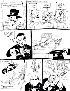
I have a comic strip published in the new issue of the comic book Sci-fi anthology FutureQuake. The story is called Social Engagement eXperiment and was illustrated by Will Pickering. I am the scriptwriter for the story.
I wrote this several years ago and pitched it to 2000AD at the Birmingham International Comics Show in 2008. They were interested but never took it. After several re-writes I sent the script to FutureQuake press. I am a big fan of their comics and thought they might like the story.
Another few re-writes later, they accepted the script, where they paired me up with Will Pickering who done an excellent job in illustrating the story.
I’m so excited about seeing this in print as it was a long slog to finally getting it published. I am also a huge fan of FutureQuake, so it is great to see my work in there next to other fantastic writers and artists. Hopefully this will be a spring board to kick start my comic book writing.

Thursday, 16 June 2011
Email Story
Thought I’d post this up. It’s a short story I wrote during an ‘Illustrate and Write’ class a few weeks back. During this class I also came up with the first Polaroid Picture (a series of images I am creating and posting on this blog).
Never the less the story involves 3 emails. One from a guy emailing his girlfriend. The girlfriend then emailing a doctor for advice and the doctor replying to the girlfriend. It is an experiment in graphical storytelling and how to establish character through text. I think the emails give a different perspective as opposed to straight up prose. The graphical element does not add to the story, but I do believe that they make the story more visually appealing.
The 3 emails are below. The story is imaginatively entitled – Emails.


Subscribe to:
Posts (Atom)